A User Experience Designer Switches from iOS to Android
Sometimes, when we talk to potential clients, they ask, “What’s your specialty? web? phone? desktop?” Our answer is usually, “Yes.” While developers may have more experience with one platform or another, great developers bring their fundamental skills to any platform. Sure, there may be a bit of a learning curve here and there, but the core principles are at play no matter where you are. We think the same is true for user experience design.
I’ve played with Android devices (both smartphones and tablets) from day one. But I’ve never lived with one. Not really truly depended on one. I’ve been an iOS guy from the start, but to be honest this past winter I hadn’t fallen in love with any of Apple’s releases in awhile. My trusty 4S was getting a little long in the tooth, but the next iPhone (with a rumored larger screen) was still months away. And then suddenly a slew of new Android devices came out and I thought… why not. If I’m going to design software for Android I should really truly live with it for awhile.
Strangely, now that I have lived with Android for awhile, the experiment has been kind of a failure in that I didn’t really learn much more than I knew already in terms of details I can use to make the software I design work better. But I did learn quite a bit nonetheless.
My first problem (of course) was picking which Android phone to buy. It seemed clear that either the Samsung Galaxy or the HTC One M8 were the ones to get – for several reasons. I wanted a phone that was representative of the Android experience. The software design nerd in me wanted the cleanest experience possible. But responsibility to our consulting clients demanded that I get a phone that a big chunk of people actually use. I’d heard rumors that the pure Android Nexus phones were going the way of the dodo, and the market share of the Google Play editions wasn’t huge, so it looked like a phone filled with Samsung or HTC “value added functionality” was the way to go. I used to work on Windows so I know how hardware companies fantasize (often mistakenly) that their software additions layered over the core OS experience differentiate their products effectively. Since most Android customers go through that, I figured I should too. Maybe things had changed since my Windows days.
I did bow a little bit to my values in choosing an HTC One M8 which had really pretty hardware, and also by choosing an unlocked version, so while I got the add-ons from HTC, I wasn’t subjected to the add-ons from my carrier. (In this case I decided to go to T-Mobile as Verizon, even with their superior network was making me insane with their crappy customer service, and incredibly high pricing.)
One final note before I dive in here… When I worked on Windows, I used to hear Microsoft employees working on the old Windows Mobile platform and on the Windows desktop platform deflect criticism of the end user experience as OEMs would “crap it up” with their software add-ons. Yes, those were the contracts that Microsoft signed. Yes, the OEMs insisted on “differentiation”. But I never felt that was a fair defense. Microsoft put out the product. The fact that they used to let their partners turn it into a garbage heap was not their partners fault. It was Microsoft’s fault. No excuses. And yes, Google now works with partners to put out Google Play versions, but if they can’t find a way to distribute and market those versions so they are experienced by the vast majority of their customers, then I think the responsibility is Google’s. So, any rebuttals to my criticisms along the lines of “HTC made that decision” are simply not going to hold water with me. Sorry. Android phones are Google’s product. And they need to be accountable for the end user experience. No excuses.
A couple of final notes before I dive in. I’ve now been using my Android device as my only phone for more than a couple of months and feel pretty confident that I’ve got the gist of the experience. I believe that user experience design is a craft. Part art, part science. Like cooking. And what tastes good is subjective. I’m not claiming to be the final word on the things I found, but I do think my observations have merit.
Here goes.
I found a long list of issues with my phone. I tried hard to discount issues that were just different than iOS. I don’t think it’s fair to criticize Android for being different than what I’m used to – for example the direction in which you scroll the “wheels” smartphones use instead of long popup menus. It would be nice if iOS and Android went in the same direction but they don’t. I can’t make an argument that one is better than the other. There are other things like this and I’ve tried not to list them here.
There are also a series of issues with the hardware or the hardware manufacturer itself. The screen seems way too sensitive – especially when just holding the phone. It keeps reacting to the side of my hand holding it which makes it do all sorts of things unintentionally. Just today I hung up on a call accidentally by just picking up my phone by the sides. Using the phone one handed is almost impossible because when I stretch a finger to tap on something the skin at the base of my thumb touches the screen and confuses the OS. And finally, HTC has added a bunch of special gestures that work about 80% of the time. Double tap on the phone to wake it up, or click on volume up when the phone is horizontal to launch into camera mode. These are great when they work. But not consistent enough to depend on.
In the end there are two main categories of problems with the user experience of my phone. The first are a result of Android’s business model. The second are, in my opinion, unfinished design.
User Experience problems that are a result of Android’s business model
The Android team at Google took a page (or three) out of Microsoft’s Windows playbook. They depend on OEMs (in this case the handset manufacturers) to distribute Android on their own “differentiated” hardware. Each hardware manufacturer (as well as the carriers with which they partner) are trying to compete against very similar Android offerings so wherever they have a chance to do something different, they do. Typically whether it has customer value or not. And often, even if their change is an improvement, it’s detrimental to the overall Android ecosystem as user skills aren’t portable if they switch to another device. Manufacturers like that, but app developers don’t. And in my experience, users find it an irritant at best.
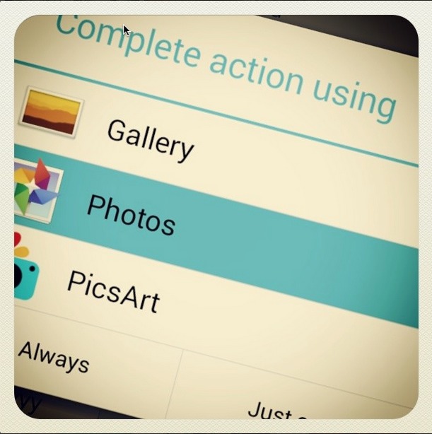
- Two Apps — Which app should I use on my phone to manage my photos? Gallery? Or Photos? Honestly, I still don’t know. One of them looks more green (I’m talking the color of the user interface not environmental impact). But that’s about all I can figure. And the moment the OS has two options, it has to bug the user to select one over the other for each action, or make them crown one as the default. Android solves this problem with their ubiquitous dialog asking me which one I want to use. And I can choose to use my selection “always” but I invariably pick “just once” because I don’t really know the difference between my choices. I have no real idea what the tradeoffs are in picking one app over the other. And if the difference is so negligible, why do they even offer both.
- Choose Your App, But Not Always — The messaging app doesn’t have a built-in photo previewer, so when I tap a photo, I have to choose which app I’ll use to see the image. But at least in this context I can choose Photos or Gallery. If I want to Attach an image to my text, then I get the choice dialog again, but only Gallery is available. Maybe this is a bug, but this bug wouldn’t exist if this piece of user interface wasn’t necessary in the first place.
- And even more — I don’t think it’s too much to ask that the default experience – especially given the fact that Google wrote the various apps that are fighting for control on my phone – doesn’t require to make choices like these. The Google Hangouts app bugs me all the time to make it my default messaging (SMS/texting) app. I have no real idea how that would be a good choice or a bad choice, so in general I just ignore the question. I suppose I could just pick and see what happens, and I imagine many people do. But how would I reverse the decision if I was unhappy? It’s probably buried somewhere in settings. Honestly, why do I even have to think about this. If they had all this time to make two photo gallery apps, couldn’t they have put some of that time into just making one great one and making it the default? Of course, I’m sure this issue has something to do with the licensing and the OEM and Google fighting between whether I should use the vanilla Gallery that comes with Android, and the souped up special more “Googley” version called Photos that Google really wants me to use.
- Hardware Manufacturer Differentiation — HTC has installed some sort of special dashboard that appears as one of my home screens. It’s a tile-based visualization of my Facebook and Twitter feeds that can occupy my entire home screen. Of course, there are apps that do this and I don’t install them. And I already have Facebook and Twitter installed on my phone. But HTC is relentless. They bug me all the time asking me to log in with my credentials, as well as sign up for other services they provide. All of course in the name of making my experience better than it would be on a competitor’s Android device. In the end, of course, all they’ve succeeded in doing is interrupting my experience and making it less predictable.
- The Fine Print of an Unlocked Android Phone — Now that I’m a T-Mobile user I’m quietly suffering through their subpar coverage — especially indoors. Imagine my excitement when I heard that T-Mobile let you make actual phone calls over WIFI. Perfect. That would be amazing when I’m traveling internationally too. But since I got an unlocked phone my phone came without a bunch of the T-Mobile Android modifications. (It took me forever to realize that I had to download the T-Mobile voicemail app to get my voicemail.) T-Mobile support kept directing me to a settings page that didn’t exist. I finally realized that T-Mobile has a different settings app in the version of the HTC ONE that they distribute. Really? The Settings app is a place that needs to be differentiated in the UI? Why is the Settings app a place where OEMs are allowed to replace the app? Windows made so many of these same mistakes. It feels like Google has learned much less from Microsoft’s old Windows judgment errors than Microsoft itself has. I did find a feature called “Internet Calling” and once I even accidentally got a related dialog to come up in the dialer, but I could sooner repeat Pi to the 25th digit than tell you how I did that. I truly don’t know and I’ve never been able to bring it up again. The T-Mobile folks tell me that I’m SOL since I got an unlocked phone and they have no way to enable wifi calling for me on my device. Thanks Google/HTC/T-Mobile. You’ve made me very very sad.
I am completely speculating of course, but I believe that there are people at Google who understand that Android still needs a fair degree of polish. And I suspect that there are Google leaders including Larry Page himself who speak passionately about the fracturing of the platform and the user experience. But in the end, if I were to judge solely based on my experience with my phone, the people who represent the OEM and Carrier interests within Google are winning the battle over the people fighting for one seamless experience. And as a result, Android users are being screwed. I know that Nexus phones were, and Google Play phones are Google’s answer to this problem, but they don’t count if Google can’t get anyone to buy them.
User Experience problems that are a result of poor design
This next class of issues is really the biggest deal for me. Because these aren’t issues that are just a result of me being used to something else. They’re also not a result of the fracturing of the Android platform due to its business model. And while I know for a fact that there are smart and talented designers working on Android, in my opinion, the following issues are just a result of unfinished design, and a lack of conviction or execution ability when it comes to getting the details right.
- Unlocking the Phone — Front and center on Android is the unlock screen. And at the bottom of the unlock screen there are several icons. Dragging on each icon unlocks the phone while taking you to the app represented by the icon — the camera, the dialer, etc. This is nice as you can launch into whatever “mode” you need for that moment. And even better (for more finicky users) this is customizable. You could launch into Instagram or Angry Birds. Whatever you decide. And if you do launch into the regular old home screen that same set of icons is docked to the bottom of all of the home screens (except for home screen on which HTC put its social media dashboard thingy). But once you’ve unlocked the phone you don’t drag those icons to launch into them, you tap them. This is because on the lock screen, an errant tap would be too easy a way to unlock the phone. But once you’ve unlocked, a tap is all you need. As UX designers we overload one piece of user interface with multiple functions all the time. And when those functions are closely related, it can be a boon on many levels. However, on my Android device, the row of icons at the bottom of the lock screen and the row of identical icons at the bottom of the home screen are rendered, well, identically. After more than two months of using the service, I still periodically tap when I’m supposed to drag, and drag when I’m supposed to tap. I can’t develop the muscle memory to do the right thing because the cues are identical and my brain’s wires keep getting crossed. (As a side note, since five spots apparently weren’t enough in the bottom bar on the lock screen, you can also take the middle icon and drag it in multiple directions with each direction launching a different app by default including the useless HTC social media home page. This adds to the
confusionfun.) - Universal Back Button — I consider the back button one of the great user interface inventions of the last two decades. I’ve always been a proponent of having a universal back button. Android has one. iOS doesn’t have one, and I have to confess, I hadn’t missed it on my iPhone (so maybe my conviction on this issue bears further thought). Unfortunately, I don’t have a great comparison as the implementation on Android is far from perfect. In fact, sometimes it’s just downright confusing. The problem is that each Android apps implements their own back button behavior. So if an app misuses it, then there’s nothing to be done. Another issue is that the back button is also used to dismiss the keyboard and dismiss modal dialogs. If I am in app A, and then I navigate to App B which I left in a state where it had a dialog displayed. It actually takes two “backs” to get back to app A. The first “back” dismisses the modal dialog, and the second takes me back to where I was. A capital crime? No. Unpredictable and annoying? Yes.
- Navigation Bar — And then there’s the issue of the navigation bar (I’ve heard it referred to as the “soft key” as well.). On my HTC One M8 it’s Back, Home, and Launched Apps (i.e. Windows alt-tab). I tried a Samsung Galaxy recently and the buttons are in reverse order. Cause you know — differentiation! (And yes I know this issue is another example of the fractured platform, but I thought I’d put it here as we’re talking about the nav bar.) Samsung also has this toolbar semi-integrated with the hardware (it lights up below the main screen) where my HTC just draws the toolbar on the screen. On the HTC the toolbar moves around depending on the screen’s orientation. This can be annoying when you’re about to hit the button and it moves. But even more annoying in HTC’s implementation is that they know that the buttons clutter the screen in some cases. So, on the camera app for example, rather than show the three buttons, they show three dots. What happens when you press a dot? The icons appear. Then you can press them and perform their functions. I’ve never seen a piece of UI that so contributes to clutter that it needs an extra step to unhide itself that provides ZERO additional functionality. (A drop-down menu isn’t analogous as it is compressing several options into the space where only one can fit.)
- Background Image — Maybe this is another bug, but you would think after so many versions of Android, they would have this right. I tried to choose an Instagrammed photo to be my background and placing it so that there was no letterboxing, and the image was in the spot I wanted was a guessing game. The preview didn’t match the end result. One other insane thing on this front, regardless of whether I choose Photos or Gallery to get the image I want to use, tapping the in-app back button to go “up” the hierarchy to pick a photo from a different album than the default one I got dropped into, simply doesn’t work. Does it go “up” the hierarchy? No. Does it go “back” to the Set Background dialog? Nope. It just dumps me out of the whole process and makes me start again. Another side effect of distributed implementation of back button logic? A bug? I don’t really know.
- Notifications — The notification bar is always oozing like an open sore. I clear my notifications periodically, but inevitably a pile of tiny incomprehensible turds appear at the top of my screen, uglifying it to no end. Sometimes I swipe it down but the logic of what shows there is completely incomprehensible to me. But when I actually need a notification, for example, to see a little number of unread messages on a third party messaging app like WhatsApp or Kik, there isn’t one. Maybe there’s a way to enable that. But on iOS it just happens by default. Not here in Androidland.
- The Notifications Drawer — If you pull down the list of notifications and want to dismiss it, just swipe up from just past the bottom of the screen. Except of course if you pulled down the notifications menu when you were on the lock screen. In that case, swiping from below the bottom of your screen won’t work. You have to carefully find a tiny strip at the bottom of the menu and swipe up on that. You know. Just because! And when you’re swiping, and you inevitably pass one of the semi-permanent navigation toolbar buttons, the phone gives you a bit of haptic feedback even though it knows that you’re not interested in those buttons. Also, just because.
- On App Notifications — And since I’m talking about notifications, I’ll admit I sure wish the content of my texts showed up in my lock screen notifications instead of just the number of texts I’ve gotten. I debated whether I was just being a baby about this since I’m used to iOS, but in fact, I think iOS has the superior design in this case. Maybe there’s a way to change it on Android (short of doing my own Android deployment) but I haven’t had the time or energy to investigate.
- Third Party App Permissions — The permissions screen when I install an app on Android always feel like the list of possible side effects I hear on a television pharmaceutical ad. “If your memory leak lasts more than four hours, go to the Emergency Room!”
- Copy and Paste — Is there a reason the clipboard user interface shows up on object everywhere but in Chrome where it shows up at the top of the screen? Oh right. The operating system and the browser are made by different companies. Oh wait. They’re not. Shouldn’t copy and paste be a system function with a coherent user interface?
- Small Icons and Too Much White Space — This next issue is a visual design issue. And i recognize there’s a lot of wiggle room here for different opinions. But here’s mine. Let’s put aside for the fact that I feel like the visual design of Android is just not super attractive or polished, I’ll leave that for another time. But with my new enormous screen I thought I’d get some benefit. But the home screen neither shows more icons than my iPhone, nor does it show the icons at a larger size. Icon sizes, and space between icons just don’t feel balanced. The space isn’t used effectively. Not to maximize utility. And not to give the right balance of breathing room. It’s like I’m seeing a concert in a stadium where only 100 people are in the audience. But I still have to stay up in my seats in the nosebleeds.
- No Panorama Shots for Me — This may be an HTC issue, but the panorama feature on my camera was effectively impossible to comprehend. I still don’t understand how to use it. My suggestion to whoever designed it. Just copy Apple until you actually know how to improve it (if that’s even possible.) And in this mode, they didn’t even give me the three dots to show where they’d hidden the nav bar. They just turn the icons off cause they’re distracting. But when you tap on one of these invisible icons – it works! So they have hidden icons that take you out of your current app. Honestly sometimes it feels like I’m being punked.
- Facebook keeps covering up my UI — One of the “features” of Android is supposed to be its openness. And this type of thing lets Facebook put it’s little chat circles over my UI, even if I’m not in the Facebook app. I’m sorry, no non-OS app should get to obstruct another app’s user interface. No matter how important that message from my cousin is.
- Typing — Typing just sucks. It just feels so innacurate. I have no idea why. But I know it’s worse. Yep, I know I’m supposed to SWYPE. But I haven’t gotten around to that yet. And shouldn’t the default typing experience that came with my phone be at least as good as the iOS experience? One bright spot however, the suggestions at the top of the keyboard are nice though. I especially like how they start showing me the kind of words I usually string together. Some funny stuff there.
- Ugly Seams Showing — I downloaded a third-party photo editing app from the Google Play Store. I tried to save the image, and it exposed me to the ugliness of the underlying file system. All sorts of weird computer-y folder names. I’m sure the developer could do a better job here, but why is it even possible for the developer to expose this stuff to an end user?
- Quick Access Isn’t So Quick — So often when I use my Android things just feel half-baked. It’s like the team had an idea and then didn’t have time to follow through on all the details or even see if their idea worked. Take for example Android’s decision to cluster phone numbers by contact. In principle that seems logical. But there are a couple of times when the principle interferes with functionality. Example #1: Dialer favorites makes me pick a person and THEN pick their number. Most people I know have one main number I call them at all the time – their cell phone. But Android wants me to select it every time. Example #2: When I message someone in the texting app I text THEM and not their phone. That makes conceptual sense except that Android dedicates a ton of space a the top of the messaging window to let me send my text to a different number for that person. I know of almost nobody among my hundreds of contacts that has more than one phone number that can be reached by text. But just in case I have to switch that a bunch, Android makes it super easy! Of course I thought that number up there was so I could call the person I’m texting. Nope. That’s buried under a menu which brings up a dialog. Can I just tap a number in that dialog to press it? Nope. A tap only selects that number, and then pressing Call at the bottom finally makes the call. It’s like the Android team didn’t think about the main things people do in their software.
- Unhold? — Another example of the Android design team dropping the ball at the one yard line: A couple of years ago my iPhone stopped gracefully handling multiple calls. I would get a second call, finish talking, hang up, and the first person would be hung up on. No idea why. Haven’t had time to investigate. Android does it right (like iOS used to). I hang up on the second caller while the first person is on hold, and my first caller is not unceremoniously dumped. Yay! Except, when the second caller disappears the UI goes back to the main dialer screen with no obvious way to take the user off hold. Have no fear, just tap the three dot menu and then buried halfway down the menu is the “Unhold” option. Super irritating. (After writing this I figured out I could just unmute the first caller to get them back. But Android uses Mute and Hold interchangeably, so I would argue this is distinctly not obvious. If Android said my first caller was “muted” when I spoke to my second caller, then I might understand. But again, this is a detail that feels unfinished at best.)
BEGIN UPDATE
I forgot to mention a couple of things I found, so I’m going to add them here. And as I said above, as far as I can tell these are not HTC customizations.
- What day is this? In the calendar app, I would pay cold hard cash for it to tell me what day of the week am I looking at when I’m looking at my calendar a day at a time. Is the day of the week not something anyone cares about anymore?
- Directions? Nope. When I try to use my phone as a GPS/nav system I always start with Google Maps which I think is an amazing app. I tap on directions and then invariably I get a dialog box saying: “Location mode isn’t supported” It then goes on to tell me that “Turn-by-turn navigation is only available in these location modes: *High accuracy *Device only” I can then cancel or go to settings. Why do directions not work out-of-the-box without any tweaks? Isn’t this one of the things my phone is for? And never mind the question of what a “location mode” is. Because I have no clue what that is. Seriously. Zero. Clue. I did tap on Settings which only made things more confusing. I might have surmised that there was a place to change my “Location Mode”. Nope. There wasn’t. At least not that I could tell.

END UPDATE
There are many additional examples, but you get the idea. I never did find out how to make the Siri equivalent come up. Or maybe I did. As the Google Now page would display intermittently. The page seems to come up periodically by accident and always when I don’t want it. I’m sure I could Google an answer but I just stopped caring. The whole phone just seems so overloaded. Everything is bursting with functionality, but I don’t feel like discovering any of it. If you have a screen dedicated to interfacing with my voice, why do you litter it with little portal-type modules for me to look at. I truly don’t understand what I’m supposed to do here. Sometimes the voice functionality would come up with some suggestions of what to say. Two of the three examples were “cancel” and “turn off”. If they picked those based on the most popular thing people do at this point, I think the Google folks need to do some soul searching.
I design software for a living, and none of it is perfect. In fact, some of it has been quite challenged. So I understand that there are likely some talented and visionary people working on my phone over at the Plex. And yet, despite their best intentions, my day-to-day Android experience is almost never pleasant. I don’t blame any individual there, but I do think it’s fair to hold the company accountable. It takes big teams to make software/hardware systems (and ecosystems) come together. And getting big teams to speak with one voice is difficult. And typically, that’s not an issue that signifies lack of design talent, it signifies lack of design leadership. That appears to be what Google is missing. In spades. But of course, I have no idea. I’m just speculating from outside.
But the single most awful part of my Android jaunt has nothing to do with anyone at Google. It’s all Apple. Right after I began to write this post, I started seeing reports in the media of widespread problems with former iPhone users receiving their texts from iOS users. I ran into that very same issue. It took an e-mail to Tim Cook to get me into Apple “executive” support. They were more helpful than regular support and very nice, but when all their recommendations failed to solve the problem they told me that my friends who couldn’t text me would have to call them and install debugging software on their phones for Apple to do anything to fix the problem, and short of that Apple could do nothing. This was a terminally unsatisfactory answer in my opinion. It’s annoying enough to my friends and co-workers that it appears that I’m ignoring their texts. I can’t conscientiously ask them to become unpaid testers for Apple to solve the problem. The Apple support person I spoke to didn’t understand my objection and that’s when our conversations ended.
My recommendation is this. Every month, one twelfth of Apple’s employees should be required to switch to Android for the month. I promise that before the second month is out this problem would be fixed for all of us.
The Bottom Line
My HTC Android phone is fine. It’s not awful. It’s not great. It’s fine. It basically works. But it’s death by a thousand cuts. These little awkward moments in the UX add up, and in the end I don’t love my Android phone. I don’t love using it. I prefer not to browse with it. I’m not excited to install new apps. And the e-commerce and browsing usage numbers for Android versus iOS bear this out. Yes Google is kicking ass in market share vs. iOS, but I doubt the Googlers working on this would claim to feel proud of carpet bombing the market with products that are good enough. I can’t say why Google hasn’t yet had the discipline and commitment to deliver a world-class polished smartphone experience, but so far in my journey, that opportunity is still before them.
Join the discussion 69 Comments
kurren
May 22, 2014 at 12:10 pm
all comes down to one single point: walled gardens makes for easier (smoother) UI experience, but poorer (**true**) UX experience.
Andrew
May 22, 2014 at 12:21 pm
After switching from iOS to Android, this is EXACTLY how I feel.
Justin
May 22, 2014 at 12:34 pm
I had been considering dropping iOS for a while and grabbing the very same phone you reference here. I am amazed that Android is still the mess that it is. I can’t really think of a good reason to switch now. It seems the little problems add up and outweigh the benefits.
Derrick
May 22, 2014 at 12:44 pm
You don’t seem to have a great grasp on Android vs. crappy android apps, or Android vs. Manufacturer problems. In fact, you don’t get it – at all. This isn’t *really* your fault, because this is super complicated, but pretty much, Android is an open garden, where Apple is a dictatorship. When you get a photo app from the Apple appstore, you’re going to get a nice Apple like system. When you get a photo app from the Android appstore, you might get a nice experience.. or a terrible one with a crappy file manager in it. There are pros and cons to each approach.
However, I really urge you to give Nexus phone a try. It’s an entirely different experience from the crap that HTC puts out. Android, as an open system, is just that: open. Anyone can use it, and anyone can screw up an android phone.
cak
May 25, 2014 at 7:37 pm
Yeah, it is a completely different experience, except it isn’t, it is mostly the same. And most of the issues you sited are still there. But hey, according to this guy is a completely different experience.
wolfcry0
May 26, 2014 at 9:19 am
Most of the issues in the article don’t exists on a nexus 5, they’re all part of HTCs software
Robert
June 10, 2014 at 7:50 am
So. Buy Nexus to get the walled garden illusion?
Paul
May 22, 2014 at 1:02 pm
The reality is you are coming from an environment where you’ve been herded into every possible way to perceive a technology. This is the Stockholm syndrome of technology in my opinion. If you are afraid of choice, don’t make one, stay on iOS. Millions of people appear to be unaffected by this horror however, and if you do not understand why that is as a user experience person, perhaps you should look a little deeper.
Nevermark
May 25, 2014 at 1:28 pm
“If you are afraid of choice, …”
This is a passive aggressive way of saying nothing. The post was quite specific about the problems the author perceived – and none of them were that he didn’t like “choice” when it served a useful purpose. Perhaps you should look a little deeper. (Another passive aggressive phrase.)
Finn
April 10, 2015 at 4:50 pm
I was an early android adopter–around 2009-2010 or so and stuck with it through late 2012. After looking at what was available in the market and realizing I wanted a good camera without owning a gigantic phone the choice was made for me. I chose iPhone. Two years later and I don’t regret my decision.
I’m at a toss-up right now. I thought about going android, as the iPhone 6 is frankly far too big for me, but then my friends who had swapped all told me “don’t.”
I don’t consider myself to be a slave to Apple. There are things I dislike about it as well. But android fans need to stop acting like they have realized the existence of The Matrix and are somehow above “sheep” Apple fans. I just like having a phone that works properly and is a breeze to use. And this is coming from someone who frequently uses Linux, manages web servers for a living, and micro-manages my PC. I do too much of that at my job. Why should I have to do it in order to make phone calls without tedium?
hillel
May 22, 2014 at 1:07 pm
@Derrick. I think I have some grasp of the problem having worked on Windows for many years. Platforms can make it easier for apps to be crappy, or they can make it harder. That was the point I made about the app exposing the ugliness of the underlying folder structure in the file system.
The reason I didn’t try Nexus is that it’s not the user experience that most Android users have.
David
May 22, 2014 at 4:54 pm
That’s a perfectly reasonable thing to do. The issue is that it leads you to attribute issues that are actually HTC skin issues to the Android design team. Play around with a Nexus of a Google Play edition HTC One, and you’ll realize that the Android team is pretty on the ball. The issues lie with the OEMs.
Robert
May 24, 2014 at 1:20 am
Exactly. As a heavy Android user I read your post and most of the time I had no idea what you’re talking about, yet you attribute these issues to Android itself.
It would be interesting to read your thoughts on Android vs Sense vs TouchWiz experience, though.
elizabeth
May 30, 2014 at 7:03 am
I mostly agree with David and Robert, who both replied to this same comment. I have the galaxy S3 and also have no idea what you are talking about in a lot of your experience with the htc. I highly suggest the galaxy lineup. That said, i have issues with android too. Ive tried friends’ iphones and the typing and screen rotation works a 100 times better, and while i wish the iphone had a back button, it can be annoying at tkmes on the android too, but then there is the option of hitting the home button to close the app just like on iphone. And i truly believe a lot of your issues are due to it being an htc device. AND due to it being unlocked. I don’t know if many people buy unlocked phones. Another thing is you have to tell the apps if they can send u notifications or not. I dont allow them too so that my notifications bar doesnt get clogged up. I have had tmobile for over 10 years and have had almost no problens with reception, recently travelled to Los Angeles and had even BETTER reception there. Havent had much opportunity to travel internationally tho. One other thing i like about android is abikity to move the cursor back in the sentence to correct things. Ipho e does not have this which means if your mistake is at the beginnning, you have to start all over, which is dumb. I wish there was a difderent company out there that was a perfect blend of iphone and android without the hassles.
hillel
May 22, 2014 at 1:07 pm
@Paul, where did I say I was afraid of choice?
Dave
May 22, 2014 at 1:17 pm
Not having access to the One, I would have loved some screen shots, but that’s probably a pain in the patoot. Great read, thanks for sharing.
James
May 22, 2014 at 1:25 pm
I agree with you 100% that Android has lots of issues but there’s a few you clearly didn’t understand.
Choice in apps (which gallery, which messaging, which keyboard) are all things I hate about iOS (which I’m on) and miss from Android. The iOS keyboard sucks. On Android I can replace it. On iOS I can’t. The iOS photo app might be better than either of the android apps but if it doesn’t meet might needs I can’t replace it. It’s the UI that pretty much any app that wants access to your photos uses to let you select a photo. On Android I can replace that. I could pick an app that sorts my images by color, or lets me tag them and search by tag or any number of other things.
Similarly with the messaging. Maybe I want every SMS forward somewhere. On Android I just replace the messaging app. On iOS I’m SOL.
I’m happy I can choose Chrome or Firefox as my default browser. GMail or something else as my default email. If your on Windows would you be happy if you were forced to use IE? If Mac would you be happy if forced to use Safari? Why does iOS get a break here?
Note: I still love iOS and I have no intentions of switching back to Android. But you seemed to have totally missed the point on a few issues. Android is about finding the best apps to replace system functions. iOS is not. You didn’t embrace that. If you did at least a few problems would disappear. You might even find a few things you’ll hate when you switch back. Watching my friends that are good with swype they’re entering messages easily 5x faster than me and with way less errors. When they do have an error they fix them 3x faster than me on iOS. That’s not enough to make me switch back but it is enough to make me upset that Apple doesn’t give me the choice.
hillel
May 22, 2014 at 1:43 pm
@James. I think you may have read more into my comments than was there. I never said I had a problem with Android letting users replace core OS functionality with alternative apps. What I have a problem with is making me make that choice up front in an out-of-the-box installation.
Tobias
May 26, 2014 at 12:51 pm
That’s more of a HTC problem. They bundle that in a weird way to promote their apps. Android as a Nexus or GPE device is straightforward. When you buy skinned android, you take a much bigger risk to trust HTC or Samsung with design
Nate
June 1, 2014 at 2:35 pm
That’s not entirely an HTC issue; Google is itself in a bit of a transition from the open-Android apps (like Gallery) to the closed-source Google apps (like Photos) and the particular case he mentioned (Gallery being needed for some things, despite Photos being the newer replacement) is still there on the latest update (4.3) that the Galaxy Nexus which is my spare phone for travel will take. Eventually, except for AOSP phones (not an issue on our market, but getting pretty big internationally) those distinctions will be gone, except where carriers re-enable them. Example where it has: Google is pushing for all Chrome on new devices, but Samsung is still providing both Chrome and “Internet” icons on theirs, even on 4.4. I don’t find it bothersome, but I can see where new users might.
Dwight
May 22, 2014 at 1:26 pm
The launching of apps by dragging upwards on the icon of the lock screen is an HTC modification; on vanilla Android, the default lock screen does not show the toolbar at the bottom so all you can do is unlock the phone (or interact with any lock screen widgets that you have placed there).
Lionel
May 22, 2014 at 6:14 pm
So, it’s Android’s ux issue if Nokia X is so crappy? Think about it. You should try the nexus line instead.
Mark
May 22, 2014 at 11:52 pm
Your fatal choice was the moment you discounted Nexus devices “because they were going the way of the dodo”.
You need to stop believing what you read on the internet. Even if there are no more Nexus phones, existing Nexus devices aren’t going to stop working. This is just another hipster rant. I bet you have a ned kelly look going on, and war a bobble hat in summer… Go back to iOS where you belong.
Alex
May 25, 2014 at 12:15 pm
“You need to stop believing what you read on the internet. ”
Sounds good. Everyone, don’t listen to this guy. He’s on the internet. His points are invalid.
hillel
May 23, 2014 at 6:10 am
I discounted Nexus devices because they aren’t the mainstream Android customer experience, and my point about them being discontinued is that they therefore have no chance to become the mainstream Android experience. As I mentioned, my goal was to have a more typical Android experience.
And while it may not be Android’s fault if an OEM does crappy customizations, it IS Google’s fault for letting them. Someone has to be the steward of the user experience and the Android ecosystem. And if it’s not Google, then who is it?
KC
May 23, 2014 at 10:11 am
The problem with your approach is that the usability issues you found would be different on every OEM’s devices. It is Google’s fault that they allow it but the experience you had should be attributed to the device you use rather than Android’s designers.
That said some of the issues you had can be blamed on Android itself. The default app chooser needs a better implementation than its current form but the functionality behind is a vital part of the android experience. As for the lock screen and keyboard those are both HTC specific problems. I myself have never seen the copy and paste ui on object as you mentioned apart from the paste option which again must be based on HTC’s implementation.
Before going back to iOS I hope you give a Nexus device a try. Google may not yet be able to control OEMs’ customizations but they do provide devices with what the experience should be. They may not be the most popular but as a designer they’ll show you the UX that all Android devices despite customizations are based on. Nexus devices have the out of box experience that you’re looking for and additional functionality can be downloaded as you need it not stuffed down your throat. The default apps are a lot better, no duplicates and a (somewhat) consistent design. You’ll find lots of issues and inconsistencies but you’ll find lots of things to love as well. You’ll surely get a better understanding of what is expected of the core UX in android apps. It’s different but it has its benefits.
Also give Google Now a proper try, it’s fantastic.
Alex
May 23, 2014 at 9:57 pm
You should have read more about the Nexus line stop.
The plan is to discontinue the Nexus line made by Google, but have it made by other manufacturers.
The “Project Silver” is meant to make other manufacturers use the stock Android without modifications.
Samsung and HTC will probably keep on selling their more expensive phones with their changes to the interface, but the vast majority of devices will be what today the Nexus are.
Dianne
May 23, 2014 at 10:18 pm
There is another way to look at who you are criticizing. It sounds like you went in to this already knowing, “I expect I would be happier with a more pure Android experience,” but wanted to get the experience that people more frequently select. Note the word select. It is pretty disingenuous to turn this in to something that was forced on them — the Nexus devices are some of the cheaper ones available, and there are other widely available alternatives like Motorola’s devices that are also much more of a pure Android experience. Samsung and HTC are well known for having their own customized experience.
So when you explicitly select one of these devices, and criticize the customizations of the device, what are you actually criticizing? It seems you are criticizing the preferences of the people who choose those devices much more than some lack of control Google should have. After all, there *are* perfectly viable alternatives that are available with a more pure experience, it is not like you didn’t have the choice.
Especially when you make statements that you couldn’t choose a Nexus device because of some internet rumors that Nexus is going away… as if this is a true statement, as if that has anything to do with the devices that are actually available to you today.
Along the same lines, when you go and criticize some media app you downloaded for exposing a file system, how much are you criticizing the platform as opposed to the fact that there are apps out there that other people like to have access to the filesystem through?
I mean when you say, “I’m sure the developer could do a better job here, but why is it even possible for the developer to expose this stuff to an end user?” Really? Do you realize that Android very much does not encourage developers to expose a filesystem, and makes it far easier to show UI that doesn’t do this (through things like the generic open content and share actions that exchange data between apps without dealing with files on a file system), so this developer clearly went out of their way to implement a file browser… and why is that? It is probably because there are some people out there who really like a file system, and this app is serving their needs.
So you are just as much criticizing the people who have a preference for that than anything about the platform actually allowing (*gasp*) a developer to write this detestable kind of thing.
And to top that all off, you actually picked an Android device that is well known as one that supports SD cards, which is just the kind of thing that will tend to be selected by people who like their file systems and removable storage and all of that stuff that is apparently an intrinsic failure in design. (In fact on current Android, when you have an SD card plugged in to a device, the built-in content browser now actually has a file browser since that is often the natural way to interact with removable storage like that. The horror!)
There are certainly many things that one can criticize about Android, it is far from perfect. But it is pretty disingenuous to criticize it for giving you the option to pick a product you know is less likely to be a match for your preferences, when there are other perfectly viable and available Android-based devices that you seem to already know you would prefer. Then calling on Google to prevent companies from making Android devices that diverge from your preference, even though a lot of people seem to like them… what is that?
Jonas M Luster
May 24, 2014 at 12:37 am
I, too, write code for both systems. Your assessment I am sure rings true for you, but it’s not mine.
Where you bemoan the intent system that gives users a choice to select which app receives a specific action (open with: Chrome or Instagram, for example) as one that makes you choose, I celebrate it as one that allows me to give someone a choice. My apps declare their intents on Android and if you have an image and you want to share it, I am in the list. On iOS my users have to save the image, open my app, load the image. This, while it opens one more requestor, is better UX in my book as it does give faster, better, cross-app interactions.
The Notification Bar is another one of those things. Same reason: UX. I can have a good, stable, interaction with the Notification system. Unlike Apple where I am not allowed to unless I jump through hoops, I can add things to the notification that are important: archive, dismiss, show, forward, quick reply, etc. and a thumbnail or crop of the image I am referring to. Try that on iOS. You call it turds, I call it a device actually telling me at a glance what’s going on.
In general I see what’s happening here. You seem to be happy with a limited information and access feature set, and that’s great. Both as a developer and as a user I am not. I prefer to be able to see what’s going on. I prefer to be able to download a gallery app and have it as a choice and become the default if I so wish rather than someone deciding that for me. I prefer to (if, as you did, I hate the experience) be able to switch out my Keyboard for something I like rather than to have to settle.
In general, and as a programmer and user, I prefer a place where UX emphasizes choice while being sensible with defaults. Apple is sensible (more than sensible) with defaults, but the choice… well, that’s where UX breaks. In Android it’s just par of sensible but the choice saves it.
Karl
May 25, 2014 at 12:19 pm
Google has enabled both crappy and great experiences with Android. But it’s an open platform that people can create on. It’s like blaming paint and canvas manufacturers because some people are terrible painters. Google has also delivered a great Android experience with Nexus. That experience is not going away, in fact the Silver program is an attempt to bring the Nexus experience (Android as it was intended to be used) to the mass market. It’s a shame for the wrong reasons you reviewed the wrong product. And also this: almost certainly the most important and powerful tool in my life is my smartphone. I’m OK investing a few minutes to figure it out and make it work as well as possible for me. I find it baffling when smart people like yourself say “just make it work, don’t bother me with the details” to something so essential and so personal.
DudeA
May 26, 2014 at 8:37 am
The user?
That’s the thing about open market – you have a choice. Don’t like HTC and their Sense UI? Don’t buy HTC. Buy from someone else. Or better yet, buy HTC and install a custom ROM. That’s also possible. It’s your choice.
Terry
May 23, 2014 at 6:54 am
This entire article is really about Google’s failure to lock down Android, not the user experience on Android. It seems to me you can’t really talk about “Android” unless you are using a device with, well, stock Android. I switched from iOS several years ago mainly because of iTunes. I figured any company that could build a UX as atrocious as iTunes wasn’t a company I wanted to be with longer term. There were trade offs to be sure. I still think iOS just feels cleaner, smoother but it takes so much longer to do almost everything. Typing, email, browsing, maps and many, many other things are just so much better on Android. You should really try a Nexus device for a month and then write an article about what is wrong with the Android user experience. As it stands, you’re doing your readers a disservice because you’re looking for answers in the wrong places.
Tim
May 23, 2014 at 12:12 pm
This is like complaining about hiring a car in the UK and realising they drive on the other side of the road. Rather than going with it and adapting behaviours to suit the platform you seem hellbent on driving against the flow of the traffic and then complaining when your bumpers, sorry fenders, get bent. I’ve recently changed from a BlackBerry to iOS. I acknowledge the UX on iOS is much superior, but still I hate it because like most humans I’m averse to change. I also still like a command line because it leaves little room for ambiguity. You, like me have become institutionalised. It doesn’t make our preferred institutions better as a consequence.
zedzed
May 23, 2014 at 10:39 pm
While you have some very valid points, I can’t help but wonder how some of this is so hard for you. You spent more time on an article complaining about things than it would have taken to just figure things out. I mean let’s be honest here, if you really gave it an honest try you would know how to open Google now.
Pietr Illerman-Nuevo
May 24, 2014 at 2:54 am
While I agree that it is terrible how stock Android gets abuses by companies like Samsung or HTC by adding questionable extensions and customizations, I also disagree strongly with your first paragraph. Sure, the principles of informatics or UX don’t change, but you can’t be a specialist in every domain. In my opinion it is complete nonsense if you state that you are an expert in web, phone, and desktop. What is “phone” supposed to be anyway? Saying that every app implements the logic of the back button itself shows that you have not even read the Android design guidelines. Every app (every Activity of an app to be precise) may overwrite the behavior of the back button, but it is not advised to do so. Doing so only makes sense in very rare occasions.
Working as a software developer myself and developing mostly Android apps during teh past few years, I have worked with several UX designers which were paid by huge companies (the names in your references don’t impress me). None of them have had even had a remote idea about the paradigms of Android and I know their blank faces very good when we (I and my colleagues) explain them that it is not necessary to re-implement address books, media players, or file choosers since Android has something called “Intents” and that there is an idea behind this. You don’t need to bind to social media APIs which you have to decide for at the time you develop an app, it is possible to share things via ways which may not even have been invented yet. Sure, the Android version of an app will look different from the iOS version, but hey!, that’s the whole idea behind diversity. I bought an Android device not because I can’t afford an iPhone, I _want_ an Android device.
I urge you to read “Smashing Android UI” by Juhani Lehtimaki if you have not done so already or to please re-read it if you already read it. Customers planning an app take you for an expert in Android UX design and they just won’t listen to the developers who “only want to make it easier for themselves” or “unfortunately can’t change anything about the interface in this phase of the project anymore”.
Apart from this rant I will celebrate the day Google will deny access to the Google Play Store for phones by manufacturers that feel the need to differentiate by turning a good piece of software into something I don’t even want to touch.
Gyan
May 24, 2014 at 6:36 am
Most of these problems are pretty easy to solve, most cases they’re perfectly valid ways to do things, but they’re just not how Apple does them.
Jeremy
May 24, 2014 at 7:14 am
I’ve used both android and iOS devices for years. Last year I switched from my galaxy nexus of 2 years to an iPhones 5s. There are a lot of things that I really do like about the 5s and iOS, in many respects (as a power user) it was a major step backward. I agree with many of the points you made and do think that the carriers and handset makers muck it up. Clean android on a nexus device was a joy to use. I don’t like apples walled garden which is consistent and dumbed down for the lowest common denominator. It is too restrictive and I always curse at the ghost of Jobs on being so dictatorial – I can’t choose default email clients or browsers or photo apps. The apple apps are good, but they aren’t the best. Android is more open and therefore more problematic and less seamless than iOS, I really wish I could have something in the middle. The 5s screen is ridiculously narrow, the keyboard sucks and my typing/texting speed is 5x faster on swype than on iOS. iOS autocorrect is a joke and auto predict is sooo bad that it is a joke. I really like aspects and I really dislike aspects of both platforms but I’d rather have openness freedom and choice than not — even if there aren’t perfectly seamless experiences. That being said I probably won’t switch back to android any time soon. I really like the slow-mo camera function and I got tired of the battery dying on my nexus. Android is a good platform, too bad google gives so much leeway to the handset makers to destroy the experience. What I’d really love is an iPhone 6 with a bigger screen, decent widgets on my home screens, the ability to choose which apps *I* want to use as defaults and not have apple shove mediocre apps down my throat — and a decent keyboard from a third party that understands word prediction and autocorrect so I don’t have to spend 2 minutes writing a text msg that should take 20 seconds. When apple can deliver something like this, I’ll stop pining for my galaxy nexus…
Jon
May 24, 2014 at 6:35 pm
There seems to be a tad bit of willful ignorance in this assessment. You are reviewing HTC Sense and the HTC One M8, not Android. Many of your gripes have everything to do with HTC’s decisions, not Google/Android’s OOTB experience.
Fair enough that you wanted to pick a phone that a regular user would use… but if you’re going to do that, then the title of this post should be “…switching from the iPhone to the HTC One M8,” since you are clearly comparing each devices’ experience — not the core Android OS with iOS.
And, FYI, the “Facebook UI” bubbles have nothing to do with OOTB Android nor HTC Sense – it has to do with Facebook’s application. Those bubbles can obviously be turned off if they bothered you so much. Again, this seems like a bit of willful ignorance to lump Facebook’s GUI decisions on an iOS v. Android assessment.
Android — in any incarnation — isn’t as clean as iOS by its very nature. Yes, it could be cleaner/simpler even though it’s open — and there is a very valid critique there. But by nature, a democracy is messier than an oligarchy. And that’s the dueling philosophies at issue here. Both are well-designed… with different priorities and desired outcomes.
Jake Taylor
May 25, 2014 at 4:30 am
I thought a designer would pay more attention to details.
Firstly, it’s WhatsApp (not What’s App). Secondly, your sentence “widespread problems with former iPhone users receiving their texts from iOS users” makes it sound as if former iPhone users have mysteriously been receiving their own previously sent texts!
Still, by all accounts an interesting article, if not a little whiny.
Rich Band
May 25, 2014 at 6:48 am
>The reason I didn’t try Nexus is that it’s not the user experience that most Android users have.
This is an pretty ignorant comment. To suggest that that the HTC One sold more than the Nexus 5 is hilarious. You imply that you wanted to try out a phone that was representative of the UX and UI of most Android users so you selected a handset from an OEM that has barely sold a million units.
Additionally, you should qualify your review as your experience not with Android, but with HTC Android because some of your comments don’t even apply to Google Android. It’s like blaming Android for the atrocity that is TouchWiz.
Said Tahsin Dane
May 25, 2014 at 7:17 am
You are right about most of the things. But I am really sad that most of them are because of HTC. I don’t know why Google let this happen. If you use Google Play edition device you can see that couple of issues you had is not there. ILastly I have to mention that the soft navigation bar at the bottom does not change when you rotate the device. Only the keys will rotate. Their position is always the same.
Silellak
May 25, 2014 at 10:09 am
Eh, some people just aren’t Android people, and that’s fine. Some people are happy with the solid out-of-the-box experience that Apple delivers with the iPhone – and that’s great! Others are willing to put up with a slightly-less-polished out-of-the-box experience and the occasional UX quirk to enjoy the power and flexibility that Android delivers – and that’s also great!
It’s always good to try new things and see what works better for your personal workflow; to only stick with single mobile OS is only depriving yourself.
That said, I’d love to see what you think of Google’s Android experience, which is, at least, much more consistent.
jbelkin
May 25, 2014 at 12:20 pm
Sounds like bratty whining to me. My Kia transmission doesnt shift as smooth as my BMW. Walmart Cola doesn’t taste as Coke. I can’t get internet connection in North Korea. Apple only owes you the best customer experience when you are an Apple customer. If you switch for whatever reason, you have to give some of that up. You sounds like a bratty whiny kid. Grow up. You can’t get everything you want unless you are entitled. As an non-Apple user, you are not entitled to the Apple experience. If you couldn’t cut it as an IOS developer, sorry you are not an A- grade developer but hey, you can make money on the other side of the fence so good luck to you there but stop annoying the rest of us.
Pingback:
May 25, 2014 at 12:21 pm
Even This iOS Designer's Email To Apple Chief Tim Cook Didn't Fix The iPhone's Broken Text Messaging App (AAPL) | Content Loop
Karl
May 25, 2014 at 12:30 pm
If I wanted to get the typical iPhone user’s experience as you did with Android, I guess I should get a 4S with a cracked screen, Facebook and a couple of awful games on it.
Pingback:
May 25, 2014 at 1:04 pm
Even This iOS Designer’s Email To Apple Chief Tim Cook Didn’t Fix The iPhone’s Broken Text Messaging App (AAPL) « INTLFACES
Pingback:
May 25, 2014 at 1:46 pm
Even This iOS Designer's Email To Apple Chief Tim Cook Didn't Fix The iPhone's Broken Text Messaging App - AndroTab- AndroTab
Joseph T Bradley
May 25, 2014 at 5:07 pm
You made some great points. I use an iPhone 5 as my primary device, but use an original Nexus 7 for several hours each day for reading or watching video. The intent dialog could be completely replaced with a section in the Settings app, that is styled after the Home settings section in Android, or the privacy settings sections on iOS. Which Android also needs – a lot of apps add many permissions which they don’t really need, and there’s no way (even on stock Android) to turn off the ability for an app to have access to Bluetooth, your microphone, etc. implementing something like this would address the concerns you bring up by making the user experience better, and would also effectively increase user choice by consolidating those choices into an easy-to-use interface.
elizabeth
May 30, 2014 at 7:50 am
Um, YOU SHOULD DESIGN THIS !! dont know if u develop apps but the kind of ything u describe sounds awesome. !!!
Pingback:
May 25, 2014 at 5:14 pm
Jordan Meyerowitz | Even This iOS Designer’s Email To Apple Chief Tim Cook Didn’t Fix The iPhone’s Broken Text Messaging App (AAPL)
Raymond Petit
May 25, 2014 at 6:17 pm
I’m not going to suggest, like others here have, that you try a Nexus device or vanilla Android. I think you should go back to the iPhone and not come back! Android is about choice! You mention the “mainstream Android experience”. Sorry to inform you, that didn’t exist! I just moved from a T-mobile GS3 to a T-Mobile Note 3. One runs Android 4.3 while the other runs Android 4.4.2. Guess what, they’re both on T-Mobile, but they are somewhat different. Same fit the many phones on other carriers. Many Android phones are still on Frozen Yogurt, Gingerbread, Ice Cream Sandwich… You get the idea. Each iteration brings something different to which the carriers put their stamp on top. You were made four iOS, because you want everything to work in a certain way, you don’t want to take the time to learn how to get the best for yourself out of your phone. Android can be overwhelming, but that’s the nature of the beast. Samsung note had an “easy” mode for those who are overwhelmed. Now, what I think should happen is that Google should use it’s muscle to force OEM’s to provide stock Android, with the option to switch to their version or vice-versa. I have to mention because it really burned me when you mentioned it, is that panorama shots were possible on Android phones long before iPhones! I seriously doubt Apple has a better implementation as they’ve only had this ability for just a couple of years.
HardyW
May 27, 2014 at 1:09 am
Actually KitKat has that option built in. Not sure where I would find that on other devices, but on the S4 its under settings > more > default applications. There is an option to choose the preferred launcher if you have installed another and also change the default sms app.
Hajo
May 25, 2014 at 6:30 pm
You don’t even need to switch to Android to encounter this — just travel abroad and turn off your data connection (due to roaming costs or whatnot) and you won’t be reachable through text messages since the phone doesn’t fall back to sending carrier SMS. The problem has been known since the introduction of iMessage, has been discussed on Apple forums to great extend. Makes me wonder whether Apple engineers ever travel or read their company’s forum…
Pingback:
May 26, 2014 at 2:08 am
Even This iOS Designer's Email To Apple Chief Tim Cook Didn't Fix The iPhone's Broken Text Messaging App (AAPL) | The Usual Sources – Where You Are The Source.
Taco Monster
May 26, 2014 at 6:42 am
As a Nexus user, very little of this article actually speaks to stock Android. Replace ‘Android’ everywhere by ‘HTC Sense’, and you will actually have an accurate article.
DudeA
May 26, 2014 at 8:29 am
Most of what he perceive as fault are just personal gripe of having to learn or choose something; both of which are what draws people to Android to begin with. Yes, there are no universal standard for OEM Skinned Android. He see it as a bad thing, I disagree. It’s a wonderful thing, it’s one of the reason by which we choose our phone phone/manufacturer. Of course if you’re with iOS, that’s just the iPhone. No choice here.
Most of others are in similar manner to that.
One that really pisses me off is the part about exposing the underlying folders to the end-user. Just because the product arent design for computer-illiterate sheep doesn’t mean it’s bad design. I personally enjoy knowing how things work, where my files are organised.
nl
May 26, 2014 at 1:33 pm
This is an incredibly long comment and I apologize for its length. I am absolutely confident that if you take the time to read it, you will gain as much understanding of why Android is in the situation it’s in and how it’s arrived there.
I’ve written this comment with an emphasis on providing accurate and unbiased information in an OS-agnostic tone, so I hope you’ll consider it as such.
——————————
Before I begin addressing your specific complaints, I have one criticism of your article as a whole: while I would never make the claim that Android has no room to improve or be made more intuitive, I’m disappointed by the number of times you concluded a question with something to the effect of “How should I know?”, “I don’t have time for this”, “I could’ve probably found the answer if I looked but I didn’t”, or “I never bothered”. The premise of your article from the outset was that you were trying to learn what Android is all about, but it seems like at every point over the course of two months that you ran across something different from iOS, you simply gave up and concluded it wasn’t worth the bother to learn. Instead of considering if there were any practical reasons why a design choice might’ve been made, you simply concluded none existed and implied it was a defect. However, to be perfectly fair, many of your complaints are valid and a result of HTC’s scattershot customization.
I have very little sympathy for one of your specific complaints, that the phone was difficult to hold and manipulate. One of Android’s greatest strengths is the wide variety of form factors you can buy devices in. The HTC One is extremely large and if you found it difficult to use because of its size, the sensible thing would’ve been to exchange it for a smaller model. I can only assume you must’ve purchased it in a way that made returns difficult, but buying an unsuitable product which you’d had ample opportunity to research and even test in a store is your mistake alone. Many people prefer larger screens, even if their smaller hands mean one-handed use is “holding it wrong”.
For what it’s worth, and I know it’s not a lot, almost every issue you mentioned – even those in the section you blamed on Android itself rather than HTC – are in fact a result of HTC’s “customization”, not a part of Android or indicative of the way Android is intended to function. Obviously just saying “blame HTC” or “blame Samsung” or “blame T-Mobile” doesn’t make the situation for users better and you make a valid point that at the end of the day this is all ultimately Google’s responsibility and it’s their mess to clean up. Later in my post I’ll explain how they’re working to do this, but for now I’ll address the things you brought up which are relevant to Android itself, functioning as intended on Nexus/GPE devices:
– Duplicate functionality in Gallery/Photos, Drive/QuickOffice, Messaging/Hangouts
If you can believe it, this was much worse in the past and Google has been making great strides in the couple years to clean it up. To everyone’s confusion they actually made it worse again recently by making QuickOffice (an Office-like software package they acquired) part of the standard software suite, despite its featureset overlapping with Drive’s by around 75%. Judging from their past actions after acquisitions like this, it’s probably safe to say the two will be rolled into one product reasonably soon.
Gallery/Photos is a result of them phasing out Gallery in favor of the Google Plus-integrated Photos app which they’ve recently made a lot more powerful. In future phones, or at least future Nexus/GPE devices, Photos will likely replace Gallery entirely. Every OEM will probably have their own “Gallery” for the foreseeable future, this isn’t likely something that can ever be “fixed” because Google mandates that their full software suite come with every Android phone shipped with Google Play access. There’s not a huge tradeoff by using one over the other so a user might as well just pick one and say “use always”. You can very easily disable the built-in Gallery or the Photos app by going into settings -> apps, then tapping the one you don’t want and choosing “disable”, or possibly “uninstall updates” followed by “disable”.
Messaging/Hangouts overlap is actually a result of Google unifying several of their old communication services into a single one, Hangouts. It’s still a work in progress, unfortunately. The newest Nexus/GPE devices only come with Hangouts, but the situation will probably indefinitely remain as with Gallery, where OEMs will always want their own customized messaging application on the device. When Google’s confident enough in Hangouts they might eventually put their foot down and mandate that no other messaging apps should be included.
– App Permissions are needlessly complicated and don’t effectively communicate their purpose
This is something Google has been addressing in recent updates to Google Play. First they minimized by default any permissions that are required as part of any reasonable expectation of functionality… basically, things like detecting if a phone call is coming in so that an app can handle losing focus gracefully, the ability to write to the phone’s storage, access the internet, and so on. In the latest update to Google Play they’ve simplified things further and also given much more concise descriptions of what permissions are for.
Because Google Play is such a critical component of an Android device, Google only rolls out its updates very gradually to ensure that any serious bugs will be discovered before widespread harm is done, so it might take a month or more for you to see the benefit of the latest release.
There has been strong backlash lately against developers asking for more permissions than they should reasonably require. Users giving poor reviews for apps that don’t adequately explain why they need unusual permissions has resulted in much better developer behavior in the last year or two.
– Unpredictable “back” button behavior
Even Google screws this up in their apps on occasion and it’s an area that needs improvement. UI predictability and consistency is one of the areas that Google has focused on most heavily in the five most recent versions (4.0 through 4.4) and as it stands now, the core of Android and most of the standard Google applications get it right. In the last year or so Google has made more of an effort to clearly define for developers how an Android application should behave, including what the back button should consistently do.
Believe me, if you think it’s bad now, you would’ve been horrified back in the 1.5-2.3 era. Progress is being made, slowly but steadily. Unfortunately it’s impossible for Google to mandate how third-party developers use the back button but better experiences should (ideally) result in more popularity, pushing noncompliant apps and developers out of visibility until they can fix their mess.
– Ugly, confusing filesystem access
This is a bit of a mixed bag. A very large portion of Android’s userbase is strongly in support of their device being left open like this because it allows for a lot more flexibility than a locked-down filesystem such as iOS uses. Many things that aren’t possible on an iPhone (without jailbreaking) are made possible by allowing applications to interact directly with the file system. Most of these uses appeal to enthusiasts and tech-savvy people, but they make Android devices much closer in capability to a full PC than competing platforms such as iOS or Windows Phone.
For example, I can download a ZIP file using Chrome, extract it and make a copy of one of the files in Solid Explorer, open the copied file, edit it in Photoshop, re-zip the extracted files along with the modified file in Solid Explorer, and then send it as an attachment in Gmail. All of this is relatively painless, despite how it might sound.
Another example is the ability to download a full season of a TV show via torrent (using only my phone), then directly copying those files off my phone when I get home.
Using a USB-On-The-Go (aka USB Host) cable, I can plug in a USB flash drive and selectively copy files between the flash drive and my phone using a file manager, or play movies or music directly from the flash drive. When I realized this, my next step was to buy a Chromecast and a wireless charger for my phone. I set my phone on the wireless charger, connected an external hard drive (with AC adapter) using the USB-OTG cable, installed AllCast from Google Play, and paired my phone with the Chromecast. The result? My phone was effectively transformed into a full-blown home theater PC on a budget of about $60, plus the cost of the external hard drive I already owned.
A more technical but still very practical example is the ability to download an app called DriveDroid (it’s in Google Play) and use it to download a Linux distribution. Next, plug your phone into a PC, select it as your boot device, and you now have a functional Linux desktop using your phone as a “LiveCD” of sorts. I’ve done this on several occasions to recover a client’s PC on-site. Virtually any Linux distribution can work this way, anything from the consumer-oriented Ubuntu to versions intended for debugging or recovery.
A much more niche but more impressive (IMHO) example is downloading an updated ROM for your phone (as in, a complete operating system) and directly installing it using only the phone itself, no external hardware required.
These are just five examples of how having full filesystem access makes Android into a much more capable operating system than its peers, but there are countless others.
…ON THE OTHER HAND!!… as you point out, direct filesystem access isn’t helpful or desirable for a lot of people. Google does recognize this and they’ve made steps in recent versions of Android to standardize, simplify, and in some respects restrict, the way users and apps interact with the file system. Things have gotten a lot better and there’s still work to be done, but Google has made clear strides in that direction, particularly in 4.4.
– Google is ultimately responsible for allowing OEMs to screw things up in the first place
It’s an absolutely safe bet that Android as a platform would never have taken off without being left open to hardware and software customization. iOS devices would have >90% market share today and the mobile market would have become effectively impenetrable.
The only way Google could succeed against Apple was to take much the same approach Microsoft did with Windows. There was literally no alternative. The downside is of course that “Android” (if it can still be called such after OEMs are through with it) suffers from exactly the same problems as Windows, as you pointed out in your article.
Google knows the situation Android’s in, but until recently they didn’t really have a mechanism aside from the Nexus program for pushing back against OEM and carrier customization. OEMs (and carriers) don’t like the Nexus program for the same reason Windows OEMs don’t like the Surface program, and few non-geek people even know Nexus devices exist. If you showed any average person a Nexus device they would probably assume it was another OEM skin, albeit one that doesn’t lag horribly at the slightest provocation and has far fewer usability issues.
At the core of Google’s inability to force OEMs to stop ruining Android’s reputation is the fact that Google’s grip on Android is actually not as strong as people often assume. Their main leverage comes from requiring OEMs to obey a set of basic requirements if they want to have access to Google Play. However, Amazon demonstrated by forking Android that a company with adequate resources doesn’t need Google’s support in order to succeed with Android, and Samsung continues to subtly remind Google that they don’t necessarily need to follow their rules either, through their continued development of Bada and later Tizen.
But remember I said “until recently”; when Google acquired Motorola (ostensibly for the patents) they immediately put into motion a program to develop extremely cheap Android devices that still provided a premium user experience. They used Motorola both to set an example of how Android can be done “right” while saving a lot of money in the process, and also as a thinly-veiled threat: “We have the means and opportunity to directly compete with you, so please don’t give us a motive.” Obviously even Google and Motorola on their own can’t compare to the industrial juggernaut that is Samsung, but Motorola at least provided Google with the possibility of a fallback position and granted them more clout and credibility in setting requirements for how Android can (and should) be used.
At the same time, Google began turning the mandatory, innocuous “Google Play Services” into something of a trojan horse: a self-updating, ever-expanding API library that greatly increases the software capabilities of Android devices, completely independent of what version of Android a device is running. To a great degree it replaces the need for OS updates in order to expand an Android device’s software capabilities, while at the same time increasing the level to which apps rely on the presence of Google’s services on a device in order to function.
It took Google a couple years but we’re seeing today the results of their influence on Motorola: their device profile has been trimmed down to a handful of easily-maintained global devices which have been explosively popular, particularly the Moto G and recently-released Moto E.
By stripping out everything but Android and starting fresh with the goal of exclusively working on things that objectively *improve* a user’s experience instead of merely *change* it, they’ve greatly reduced the processing overhead commonly associated with bloatware-plagued Android devices and made it possible to have an excellent experience on lower-end hardware. Even at their extremely low price points (Moto E: $130, Moto G: $180, Moto X: $350) they’re sold at a profit, and they offer the same or better experience as >$700 devices, albeit with compromises on storage size, camera quality, and high-end gaming performance. Another benefit is that because of Motorola’s relatively lightweight software changes, they’re able to update their phones’ operating system very rapidly, even outpacing Google’s Nexus and GPE devices on occasion.
With the additional leverage Motorola and Google Play Services have provided Google with, they’ve begun forcing OEMs to comply to greater and greater degrees with their vision for Android. The result? On the same day as Samsung announced they would begin to step back from their efforts to turn their Android skin into something entirely unrecognizable as Android in any form, Google announced they were selling Motorola to Lenovo. Lenovo has committed to keeping Motorola on its current trajectory, developing phones like the X, G, and E which smartly balance price with user experience, unladen with excessive customization. Lenovo is one of the best Windows OEMs, with the same reputation as Motorola: reliable hardware for a fair price with relatively low levels of “customization”.
Samsung still has the option to stab Google in the back and switch to Tizen, but they’re now faced with an app ecosystem that relies increasingly heavily on Google’s exclusive services, an OEM with global reach that absolutely crushes their own hardware offerings at the same price points, and an increasingly commoditized hardware ecosystem where price:performance matters far more than half-baked software gimmicks that only work in TV commercials. This puts Google in a very strong position, able to more effectively dictate what can and can’t be done with Android.
——————————
——————————
——————————
TL;DR: Almost all of the things you complained about, even those you directly blamed on Android or Google instead of HTC, were in fact HTC’s fault. Much worse problems exist on Samsung devices. Google is very well aware of the other problems but until recently hasn’t had the ability to enforce measures to correct them, and lately they’ve been making great strides in fixing these sorts of long-standing issues in Android. Also, file system access is a very good thing.
——————————
——————————
——————————
If you’re interested in seeing how Android is intended to function but don’t want to spend the money on a Nexus or GPE device, I recommend picking up a Moto E or a Moto G. They’re GPE devices in all but name.
While simply seeing how Android is intended to function won’t change the fact that OEMs and carriers alike seem intent on taking every possible step to ruin it, you will be able to see the direction Google will be steering Android now that they have the clout to do so.
Nate
June 1, 2014 at 2:49 pm
Really nicely put; almost every single point I wanted to make, you’ve already covered (and in better form than I would have.)
The one thing I can add re: hillel’s original article is regarding the T-Mobile “Wi-fi Calling” feature — that’s one thing that a Nexus device (or iOS device) would not have helped with. T-Mobile restricts it to devices they sell and can customize the base image on. I don’t know whether it’s for security reasons, other technical ones, or just branding, but there is no way to get it via an app (and I’m not clear whether it’s even practical to integrate it into a custom ROM — I’ve seen some discussion of it on xda-developers but don’t remember the conclusion.)
Traveling internationally, it is invaluable for free calls to/from the US anywhere I have wi-fi access! — and it’s very handy in parts of the US where the T-Mobile network is weak. Wi-fi calling is one of the bigger reasons I did not go with an Nexus 4 last generation or Nexus 5 this generation.
Pingback:
May 26, 2014 at 3:41 pm
Spitballing WWDC 2014 — Pixel Envy
Pingback:
May 27, 2014 at 6:52 am
OUCH… This is what happens when a design expert switches from the iPhone to Android | POPFIX - Celebrity, Tech, Sports News
Matt
May 27, 2014 at 8:58 am
You’re an idiot. That’s all.
Ryan
May 27, 2014 at 9:45 am
I switch back and forth with each phone upgrade and I agree mostly. Though I applaud your desire to be like most users (though you should have picked up a galaxy in that case), really the Nexus phone is the only Android a UI person could enjoy using. iOS and Android each have UI warts and Android has more of them, but as someone who uses my phone for work all the time, I find my Nexus 5 and stock Android to be more efficient once you buy in. My previous Android phone was the first HTC Evo and I wanted to throw it about once a day.
Android just feels so much faster (combination of hardware and less animation) than my iPhone and screen is so much better that I don’t look forward to switching back next year for the first time despite the warts.
Nate
June 1, 2014 at 2:44 pm
A lot of it is a matter of taste; I’m quite happy with Samsung devices, and in general find their visual customization (and preference for hard buttons) an improvement over the stock Android experience. It’s a pity (absent custom roms) that I have to accept all the other bloatware to get TouchWiz, but right now that’s a cost I’m willing to take.
Pingback:
May 27, 2014 at 5:00 pm
Khichdi Linkfest May 28th 2014 | KorAiran
Randy
May 27, 2014 at 6:08 pm
In your complaint about the “location modes”, your screenshot shows the “settings” button. You even claim you went to the settings menu and couldn’t find it. You must have overlooked it, because hitting that settings button on the pop-up window will take you to the exact menu showing the Modes section where you can select High Accuracy, Battery Saving, or Device Only. As for why it doesn’t default to High Accuracy, my guess would be that battery life is more important to your average user than having an extra button to start navigation is, especially once you’ve done it once and learned how it works.
Some of your other problems were self induced. You purposely bought a phone that was unlocked to get away from carrier bloat, and were then upset when you also lost carrier specific features like wi-fi calling. You were also upset about the size of the phone, when you picked it out from a sea of smaller phones which are still quite good.
In your complaint about Facebook Chat Bubbles, you’re neglecting to account for one little fact: it’s optional. If you don’t like it, just turn it off. Problem solved!
Some of your problems were self induced. You purposely bought a phone that was unlocked to get away from carrier bloat, and were then upset when you also lost carrier specific features like wi-fi calling. You were also upset about the size of the phone, when you picked it out from a sea of smaller phones which are still quite good.
You’ve noted that the navigation bar is different between the Galaxy S5 and the HTC One. That’s because Samsung has refused to follow the suggested guidelines for using the Soft Keys on screen buttons. An attempt is being made at creating a standard layout with standard actions, but some manufacturers of popular devices are still not falling in line. You can hardly blame Android as a whole for this. In your example of the camera app, hiding the buttons serves the function of allowing the viewfinder to fill the display, while still showing you an approximation of where the keys would be if you needed to activate them. It’s a pretty simple system really.
Your issues with swiping the notifications drawer are only half correct. You’re correct that if you’re on the lock screen you have to start on the bottom edge of the bar and swipe up, as opposed to from the bottom of the screen. However, you then go on to complain about the haptic feedback of hitting one of the nav keys and claim that the phone “knows that you’re not interested”. How do you think it would “know” that you’re not interested? You can hit any of the navigation keys while the notification drawer is pulled down and have it perform its normal function.
You mention wanting to see better information on your notifications on your lock screen. Did you know you can replace your ENTIRE lock screen? All of it, completely. Those slide up icons you don’t like? You can get rid of them. (By the way, that’s the same way it works in IOS 7 with the camera slider). You want horizontal sliding icons instead? Doable. You want weather? emails? text messages?music controls? All doable. You want nothing but an unlock slider? Also doable. That’s the beauty of Android.
The Panorama Mode is quite easy to use, but it’s not the same as Apple’s because it’s intended as a 360 pano and not just a wide shot. I also don’t have the problem of my buttons going missing; they become the dots that the camera app always has. I don’t know what to tell you if yours are actually disappearing, but I do know that the functionality of the pano mode is explained with a popup when you open the Pano360 mode.
In your complaint about Facebook Chat Bubbles, you’re neglecting to account for one little fact: it’s optional. If you don’t like it, just turn it off. Problem solved! The concept behind this feature is actually so popular that multiple other apps have popped up to provide this functionality for text messaging and internet browsers too. People want to be able to multitask on their devices and be able to have a conversation without switching apps completely every time a message comes in or needs to be composed.
You mention that the keyboard sucks out of the box, and you’re right. Sometimes I think the manufacturers don’t even try because they know that the keyboards on the market are just that much better. If you’ve haven’t looked for an alternative though, you’re really not making an honest attempt at getting to know Android. There are at least a dozen keyboards on the play store, and Swype, Swiftkey and Fleksy are all great keyboards.
I’m trying to understand your Quick Access problem as it relates to messaging but I’m just not getting it. The addition of the phone number under the contact name takes up no more space than simply having the contact name there does. You can test this by finding a contact that only has one phone number listed. If there is only one number available, it doesn’t list them. I’m also not sure how you expect your cell phone to know if the phone number listed can receive text messages to know if it should be displayed or not. Either way, many people have a work phone and a personal phone, so the feature certainly has uses, even if you personally don’t need it. Once again though, you can just go to the play store and completely replace your messaging app with one that works and looks the way you want it to.
As an aside, within the stock messaging app, you can click the menu overflow button (it’s the three stacked squares in the top right) and click Call. Once again, other messaging apps can make this feature much easier to access.
Your calendar problem is a problem of you overlooking something that has been there the whole time. he default calendar app displays the day and date at the top of the screen in both Day and Agenda views. It also shows the day of the week above the columns in the Month and Week views.
In your complaint about the “location modes”, your screenshot shows the “settings” button. You even claim you went to the settings menu and couldn’t find it. You must have overlooked this, because hitting that settings button on the pop-up window will take you to the exact menu showing the Modes section where you can select High Accuracy, Battery Saving, or Device Only. As for why it doesn’t default to High Accuracy, my guess would be that battery life is more important to your average user than having an extra button to start navigation is, especially once you’ve done it once and learned how it works.
Hopefully this will help you solve some of your android problems, even though most of them weren’t “problems” so much as they were a lack of effort on your part. A HUGE part of Android is that you can customize it if there’s something you don’t like, so you’re not stuck with stock apps that don’t meet your exact needs.
Randy
May 27, 2014 at 6:10 pm
Some of your problems were self induced. You purposely bought a phone that was unlocked to get away from carrier bloat, and were then upset when you also lost carrier specific features like wi-fi calling. You were also upset about the size of the phone, when you picked it out from a sea of smaller phones which are still quite good.
You’ve noted that the navigation bar is different between the Galaxy S5 and the HTC One. That’s because Samsung has refused to follow the suggested guidelines for using the Soft Keys on screen buttons. An attempt is being made at creating a standard layout with standard actions, but some manufacturers of popular devices are still not falling in line. You can hardly blame Android as a whole for this. In your example of the camera app, hiding the buttons serves the function of allowing the viewfinder to fill the display, while still showing you an approximation of where the keys would be if you needed to activate them. It’s a pretty simple system really.
Your issues with swiping the notifications drawer are only half correct. You’re correct that if you’re on the lock screen you have to start on the bottom edge of the bar and swipe up, as opposed to from the bottom of the screen. However, you then go on to complain about the haptic feedback of hitting one of the nav keys and claim that the phone “knows that you’re not interested”. How do you think it would “know” that you’re not interested? You can hit any of the navigation keys while the notification drawer is pulled down and have it perform its normal function.
You mention wanting to see better information on your notifications on your lock screen. Did you know you can replace your ENTIRE lock screen? All of it, completely. Those slide up icons you don’t like? You can get rid of them. (By the way, that’s the same way it works in IOS 7 with the camera slider). You want horizontal sliding icons instead? Doable. You want weather? emails? text messages?music controls? All doable. You want nothing but an unlock slider? Also doable. That’s the beauty of Android.
The Panorama Mode is quite easy to use, but it’s not the same as Apple’s because it’s intended as a 360 pano and not just a wide shot. I also don’t have the problem of my buttons going missing; they become the dots that the camera app always has. I don’t know what to tell you if yours are actually disappearing, but I do know that the functionality of the pano mode is explained with a popup when you open the Pano360 mode.
In your complaint about Facebook Chat Bubbles, you’re neglecting to account for one little fact: it’s optional. If you don’t like it, just turn it off. Problem solved! The concept behind this feature is actually so popular that multiple other apps have popped up to provide this functionality for text messaging and internet browsers too. People want to be able to multitask on their devices and be able to have a conversation without switching apps completely every time a message comes in or needs to be composed.
You mention that the keyboard sucks out of the box, and you’re right. Sometimes I think the manufacturers don’t even try because they know that the keyboards on the market are just that much better. If you’ve haven’t looked for an alternative though, you’re really not making an honest attempt at getting to know Android. There are at least a dozen keyboards on the play store, and Swype, Swiftkey and Fleksy are all great keyboards.
I’m trying to understand your Quick Access problem as it relates to messaging but I’m just not getting it. The addition of the phone number under the contact name takes up no more space than simply having the contact name there does. You can test this by finding a contact that only has one phone number listed. If there is only one number available, it doesn’t list them. I’m also not sure how you expect your cell phone to know if the phone number listed can receive text messages to know if it should be displayed or not. Either way, many people have a work phone and a personal phone, so the feature certainly has uses, even if you personally don’t need it. Once again though, you can just go to the play store and completely replace your messaging app with one that works and looks the way you want it to.
As an aside, within the stock messaging app, you can click the menu overflow button (it’s the three stacked squares in the top right) and click Call. Once again, other messaging apps can make this feature much easier to access.
Your calendar problem is a problem of you overlooking something that has been there the whole time. he default calendar app displays the day and date at the top of the screen in both Day and Agenda views. It also shows the day of the week above the columns in the Month and Week views.
In your complaint about the “location modes”, your screenshot shows the “settings” button. You even claim you went to the settings menu and couldn’t find it. You must have overlooked this, because hitting that settings button on the pop-up window will take you to the exact menu showing the Modes section where you can select High Accuracy, Battery Saving, or Device Only. As for why it doesn’t default to High Accuracy, my guess would be that battery life is more important to your average user than having an extra button to start navigation is, especially once you’ve done it once and learned how it works.
Hopefully this will help you solve some of your android problems, even though most of them weren’t “problems” so much as they were a lack of effort on your part. A HUGE part of Android is that you can customize it if there’s something you don’t like, so you’re not stuck with stock apps that don’t meet your exact needs.
Akash
May 27, 2014 at 11:04 pm
A great read indeed! I agree with your points author but to an extent where you took the errant to a personal level. I know I love iPhone, I know you do too; I see the points you put up are accepted in the community but not ALL meritorious. Its easy to find mistakes and I can do that with iOS also.
Nevertheless, it was fun! Of course, if these weren’t there, iOS sales would not have surged up. A system is runned by both the ruling and the opposition :D
Sumeet
June 3, 2014 at 9:49 am
Refer to the IOS 8 specifications. IOS is simply copying UX Guidelines from Android.
– Admitting that IOS Notifications were lame, and now they include Widgets
– Admitting deficiency in IOS Keyboard, and allowing 3rd Party Keyboards
– Finally… drive integration
– ‘Hey Siri’ :-)
Not to mention the previous Control-Center lift-offs etc.
Also, we know that Apple is considering bigger phones, which they had earlier said were un-usable.
Maybe in IOS 9 they will finally admit that the Desktop should be optimized, so that you can choose the Icons to put on it, rather than dealing with 150 app icons floating across dozen screens.
And.. all the IOS fanboys will be applauding and cheering, with the revolutionary breakthroughs :-)
I am sure that IOS9 will look towards introducing
MR.Y
September 13, 2014 at 1:03 am
I totally agree with your sentiment here. I too moved from iphone 4S, bored by ios, and envious of the large screen and customisability (mainly keyboard). However, there are so many usability/design issues with Android, it has made me want to go back to iphone.
Many people in the comments are saying, try vanilla Android on a nexus, but I am on a Nexus 5, and I experience most of the problems you have stated. It’s true that some of the problems may only be specific to the particular phone/brand, but whichever phone you are on, I’m sure you will get similar problems that is particular to the phone.
It is great for people who can spare the time, or love spending time to customise and hack, but I don’t wish to spend all my time on that.
One thing that many people commenting here seem to be misunderstanding, is that the article points out flaws in design. Choice, customisability and freedom is good, but it can be better designed.