Seven App Store Design Tweaks to Improve New App Discovery #dreamprojects
When you design software for a living like we do here at Jackson Fish Market, it’s hard not to look at the software you use every day and imagine how you might tweak it yourself given the opportunity. As an app developer, who’s had one or two modestly popular apps, a few that did ok, and a bunch that collected dust, we are very familiar with the excitement and disappointments of Apple’s iOS app store as both developers and users. The app store is wildly popular and considered the gold standard in terms of third party app marketplaces. But it has problems.
In the early days of the app store, unknown developers rocketed to the top of the charts with wildly innovative apps that looked gorgeous and offered us whole new categories of functionality. The gold rush ended years ago for the overwhelming majority of small developers, and now the charts are stuffed with big players raking in big bucks, while the long tail of developers are never to be heard from after their brief appearance in “What’s New”.
We believe, that Apple and the small developers trying to break through are aligned when it comes to adding more quality apps to the app store. We have no doubt that if Apple could flatten the curve a little bit and let smaller developers have a decent living wage, even at the expense of Clash of Clans making a little less money, they would in a hearbeat. It’s in Apple’s best interest to have as many developers making a living as possible with a diverse and high quality set of apps. But having that goal is different than making it a reality. What do you do when the 300 pound gorillas rise to the top and suck all the oxygen out of the room?
With absolutely no permission from Apple and zero inside information we’ve decided to take a stab at some tactics that Apple might use to achieve this goal. You might say that proposing solutions to Apple on this front takes some degree of arrogance on our part. And you wouldn’t be entirely wrong. Apple has world class designers who are thoughtful and talented and have no doubt explored this problem quite well. But that doesn’t mean it’s not a fun exercise for us to do the same. But please know, we do this with utmost respect for the folks at Apple who’ve been chewing on this problem for some time. We have no doubt they’ve explored all our ideas below and others. But they don’t get to share those, and we do. :)
With that context out of the way, let’s get to the fundamental problem: How do you get users to try new apps in a world where the ones they have are good enough? Trying new apps often has a learning curve. Sometimes there are actual costs (sometimes they are hidden though perhaps slightly less so these days as Apple tells you in advance which apps monetize via in-app purchases). Trying new apps is time consuming. And how would you know to try a new app when there are millions of apps in the app store, but only the top couple of thousand are featured in the various charts, lists, and curated guides in the app store?
Suggestion #1: Hidden Gems
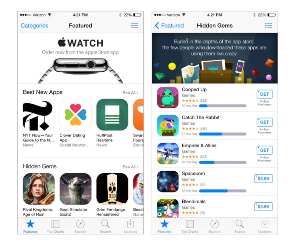
We have charts for the top selling apps, the top grossing apps, and the top downloaded apps. But what if we had a chart for the apps that haven’t been downloaded a ton, but are getting used like crazy by the few folks that have downloaded them? Apple knows not just when apps are installed but when they’re removed as well. Why not use all that data to reward apps that have been downloaded, not removed, and are generating minutes of engaged usage by their tiny but loyal fanbase?
Suggestion #2: On Quit
[TRIGGER WARNING — putting ads for apps in the OS, but outside the app store]
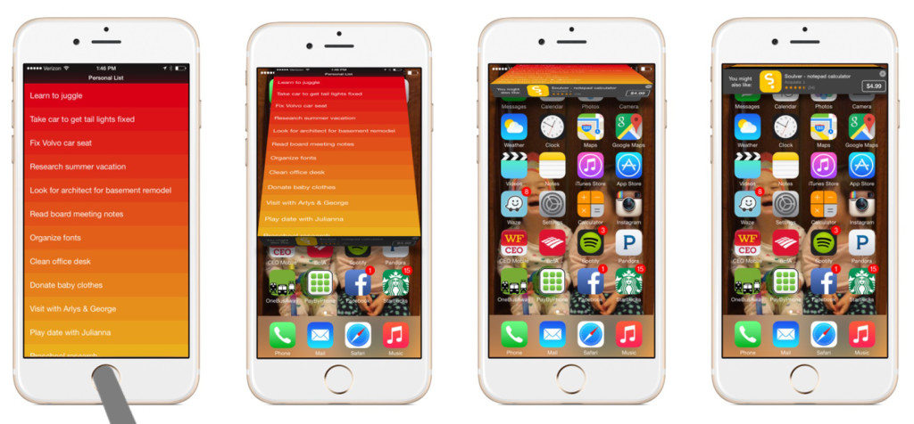
Putting what essentially constitutes an ad for an app you don’t have currently installed outside the app store is dangerous territory to be sure. But before you dismiss this entirely, read on. (After all, this is just a thought exercise, so let’s explore all kinds of thoughts!) There is a time when you’re in between contexts, and letting you know about a new app may be appropriate for your current state of mind. And there’s a convenient tiny spot to put just such an ad. Today, when you navigate away from an app by hitting the home button, there is a very fast animation that shrinks and fades the app away as the home screen appears. What if that transition revealed a small ad for an app you might like based on the app you were just using? And what if that ad showed up in the convenient notification space Apple has already reserved at the top of the screen? The recommendations could be done a la Amazon (“People who used this app, also used this app.”). The ads wouldn’t impede the user from doing what they were already going to do and would only appear periodically and never interfere with a notification you’ve already opted into. They would also of course disappear after a couple of seconds.
Suggestion #3: App Dating
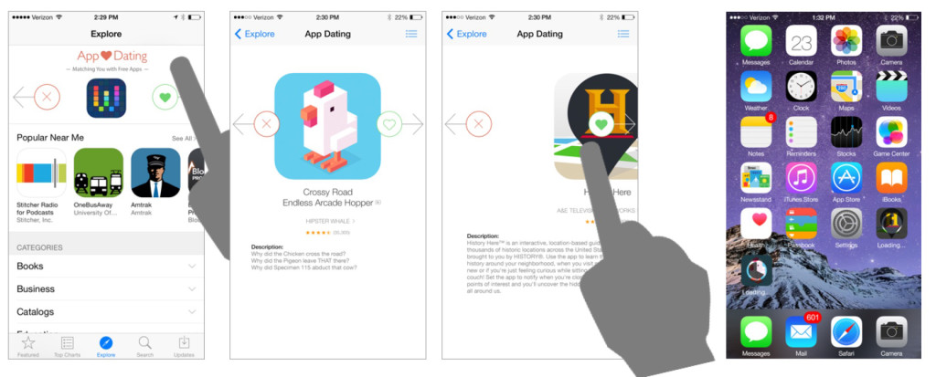
One of the things we imagine the App Store designers fantasize about is that exploring the app store would be a fun activity. Something you did periodically just to see what’s new, like browsing a newsstand or a record store. And there is probably a single digit percentage of iOS users who do just that (and it’s probably a higher percentage for games). The question is, how do you make that experience more engaging, more rewarding, and more pervasive. One thought we had was stealing a page from Tinder (and the dating apps that preceded it). What if there was Tinder for apps built right into the App Store? Swipe right to install, swipe left to banish. Not only would users get exposed to a lot of new apps in a short amount of time, but Apple could track right and left swipes and understand which apps are doing a good job enticing users to install them and use that data to improve recommendations. Of course, for apps that cost money, there would be a confirmation/TouchID moment, but for the plethora of free apps, a simple right swipe would add the functionality to your home screen with no further interaction needed.
Suggestion #4: Celebrity Curation
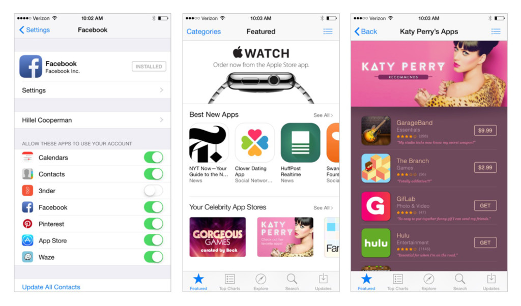
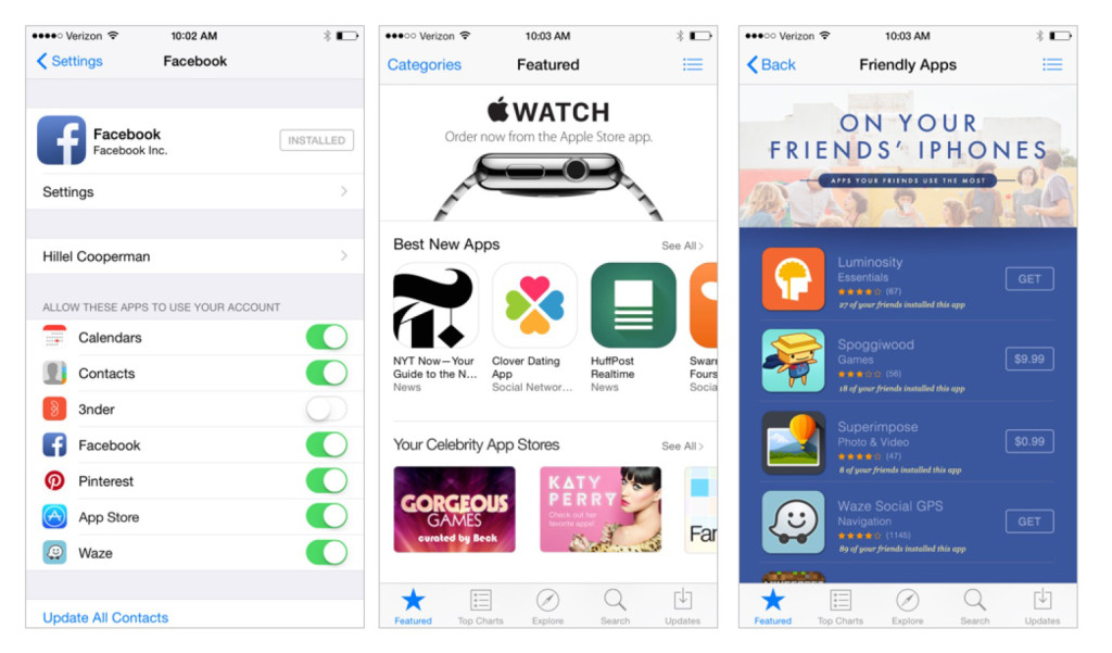
We live in a celebrity and social media driven culture. Apple is turning to more curation to feature unknown apps in the app store. Why not get even more focused and resonant with users by mining their Facebook and Twitter accounts for the celebrities they follow and then work with those celebrities to create curated App Stores within a Store. We chose Katy Perry as our celebrity recommender.
Suggestion #5: What Are Your Friends Using
And since we’re mining Facebook data, why not recommend apps based on what your friends are using? Apps only used by a couple of your friends would be excluded to allay privacy concerns. But we know that people’s social networks are huge influencers of what consumers’ purchase. Why not leverage it? Facebook on mobile is doing gangbusters business recommending apps for download. Apple should be eating into that pie by offering the functionality natively in the app store.
Suggestion #6: App Usage Analytics
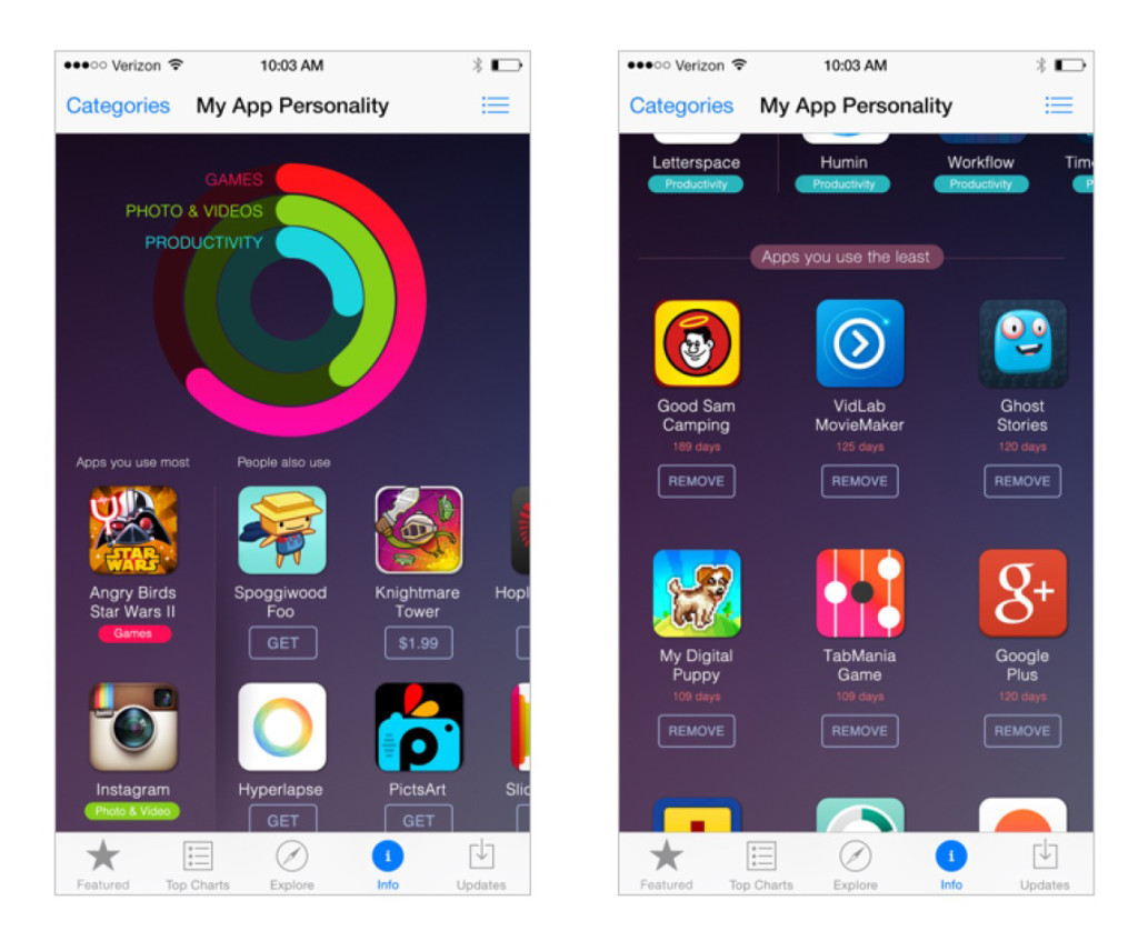
Marketers and engineers are vociferous users of analytics to understand customers in a wide variety of ways. We believe that many customers are just as interested in seeing detailed charts, graphs, and numbers for their own behavior. Think of it as FitBit for your app usage. You could even have a sort of “thumbprint” of your app usage “personality” appear at the top showing what kind of user you are. (Whether you share that or not would be your choice.) You could understand which apps you use, see recommendations based on your favorites, and even see which apps you don’t and should consider removing.
Suggestion #7: On Remove
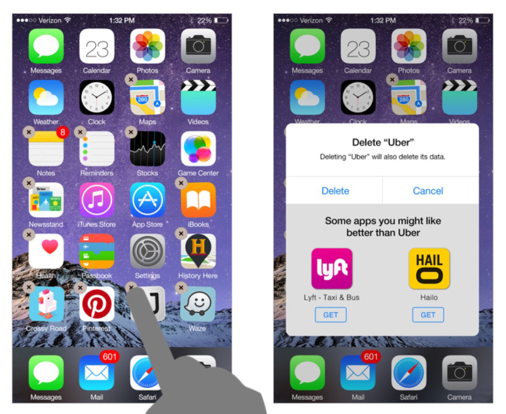
OK, if you barfed on suggestion #2, you may want to hold your nose on this one. But bear with us… we think that a good suggestion from the app store in this scenario could potentially be real value add functionality. In suggestion #2 we considered letting you know about new apps when you quit an app. But there’s another point when you may be even more strongly considering going to an app you may not even know about yet – that’s when you remove an app from your device. “Don’t like the app you just removed? Let us recommend a couple of others to do the job better.”
That’s just a few of the ideas we mulled on how to help users find apps that may not make it to the top of the charts. We’re sure there are other good ones too that we didn’t illustrate. As a technology brand and design consultancy, we deal with challenges like this every day for our clients and in our own software. Of course, the iOS App Store, is one of the biggest stages there is in which to experiment with new techniques for encouraging users to explore new apps from third party developers. That said, since the platform is so big, the stakes are that much bigger if you screw it up. The designers at Apple no doubt have a “first do no harm” mantra, as they should. This after all is the price of success. Luckily, since we’re just making our suggestions from the outside looking in, we have no such constraints. We also don’t work for Apple so we don’t need to keep our ideas off the internet. :)
No doubt Apple and others will keep tackling this problem. We hope that someone cracks it as coming up with good design that exposes the hard work and new ideas of small creators is something I think we would all be happy to see.


